
the blog
editorial
brands
lifestyle
categories:
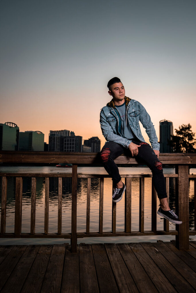
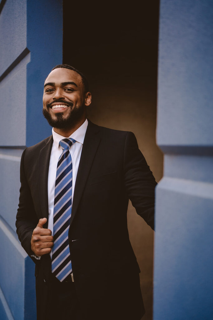
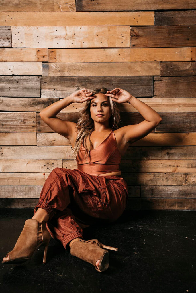
1. Be comfortable.
It’s totally normal to get the urge to shop for new clothes for a photoshoot—and if that’s your thing, go for it! But let’s chat about comfort for a minute.
Think about it: are you going to feel more like yourself in your favorite, perfectly broken-in jeans and tee, or in that clingy new dress you just bought? The best choice is almost always the one that’s tried and true. You need something you know moves with you and hugs you in all the right places. I’m not saying you have to wear a T-shirt and jeans! You can absolutely change it up if that’s what you’re feeling. But if you’re chasing that authentic, candid vibe, you need to show up as yourself.
If it’s a certain vision you’re after, we want an outfit that compliments that vision. Ultimately we’re here to capture this awesome chapter of your life, and that starts with you feeling completely relaxed and confident in your own skin. What brings that confidence and comfort varies from person to person! Sometimes an out-of-the-ordinary outfit can give you baddie energy, and if that’s the case I am 100% here for it.
2. Bring more than one outfit.
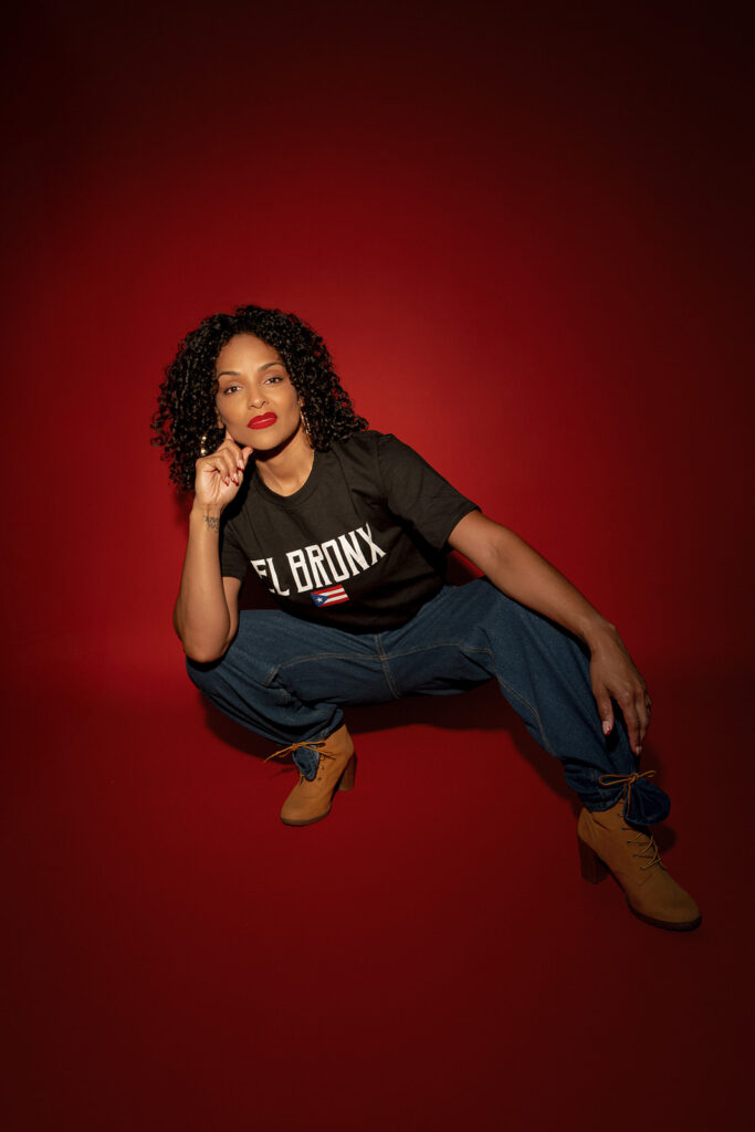
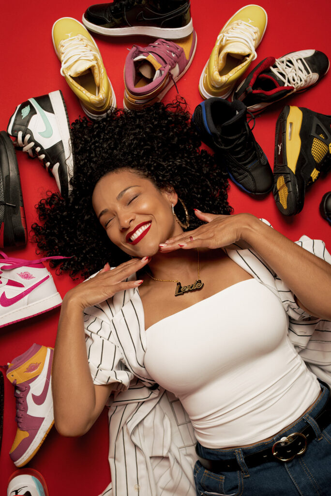
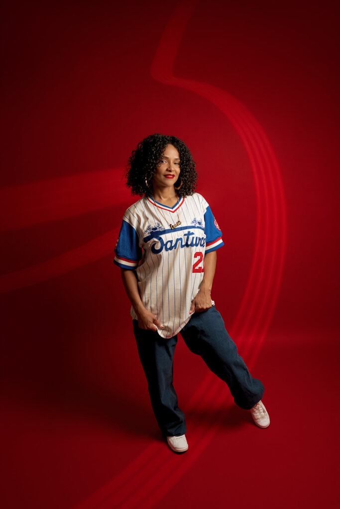
Bring two or three outfits that make you feel amazing, and we can play around with different combinations on the day of the shoot. We want options!
I’m not trying to photocopy trends; I’m looking for the most authentic you there is. Bring pieces that help you express yourself—I want your true, full personality to grace my lens! Having options also helps us make sure your look perfectly fits the location, keeping the focus exactly where it should be: on you.
3. Showcase your personality.
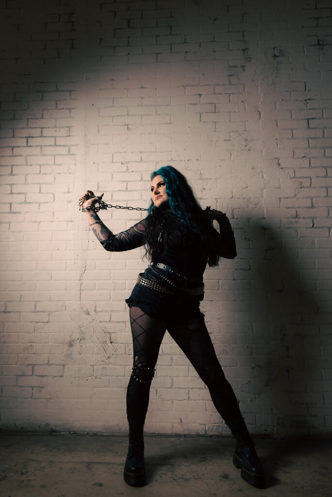
I’m am down for it all, no judgment. If you’re in a heavy metal band and want to scream at the sky while smashing something, throw on your best concert gear and count me in. If you’re a drama kid at heart who lives for the spotlight, I’ll help you turn your session into a stage. And if you’re a chill jeans and T-shirt kind of person? Let’s work with that.
I want your photoshoot to be unlike everyone else’s. I want it to be yours.
4. Let’s talk color schemes.
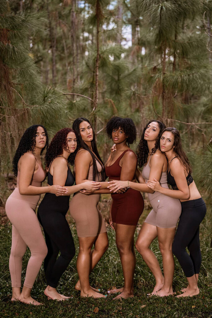
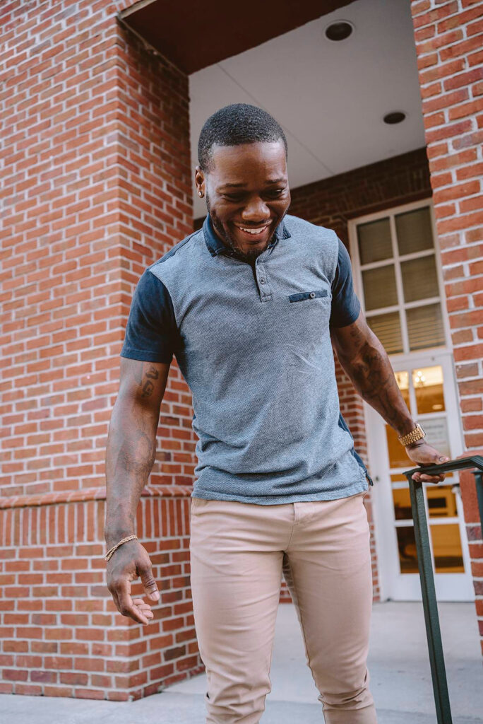
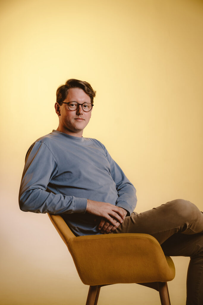
Aim for neutrals, earth tones, pastels and jewel tones. These colors naturally complement almost any environment, and they look stunning when printed and framed on your wall.
Now, don’t get me wrong—I’m not advocating for a beige world of quiet, inoffensive colors! By “neutrals,” I just mean softer (less saturated) tones. Primary colors (the red, orange, yellow, etc. you’d see on a school color chart) are quite bold. Sometimes they can be so intense that they actually distract from the main subject (which would be you).
For example, instead of electric blue which is super bright, go for something closer to a sky blue. Instead of bright orange, go for ochre or apricot. If you’re not sure what these shades look like, search them online. You can even take it a step further to see which color season complements your complexion (cool/warm, spring, summer, fall, or winter).
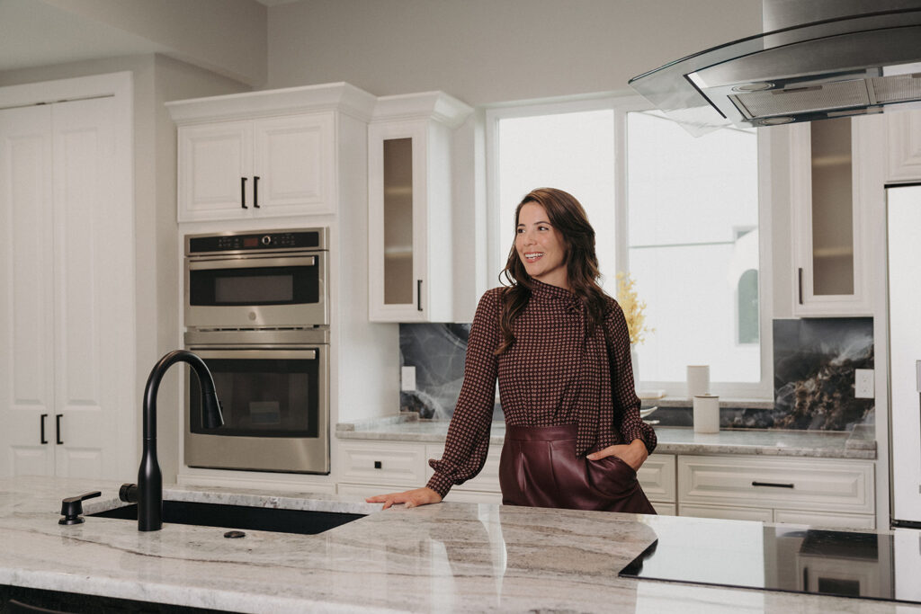
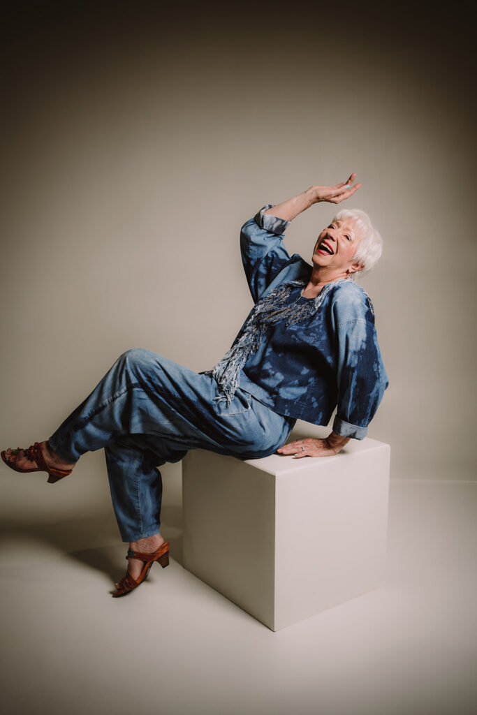
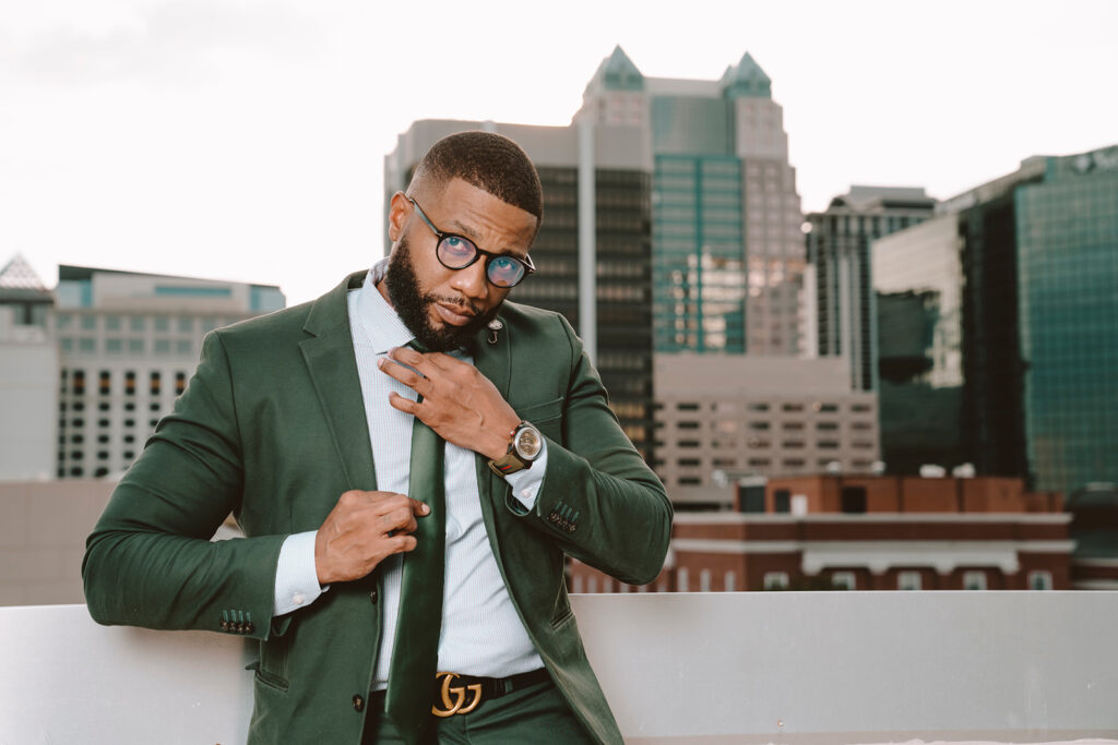
Pastels are softer colors with white added; jewel tones are softer colors with black added. Examples of pastels are periwinkle, lilac, and pale yellow. Examples of jewel tones are maroon, forest green, and navy blue.
A good rule of thumb here is to choose to either complement your natural environment or contrast it. A mustard dress in a deep green forest will look epic because of how much it pops. Contrast is fun, but a bright pink, high-contrast pattern might feel a little out of place. It depends on the feeling you’re after!
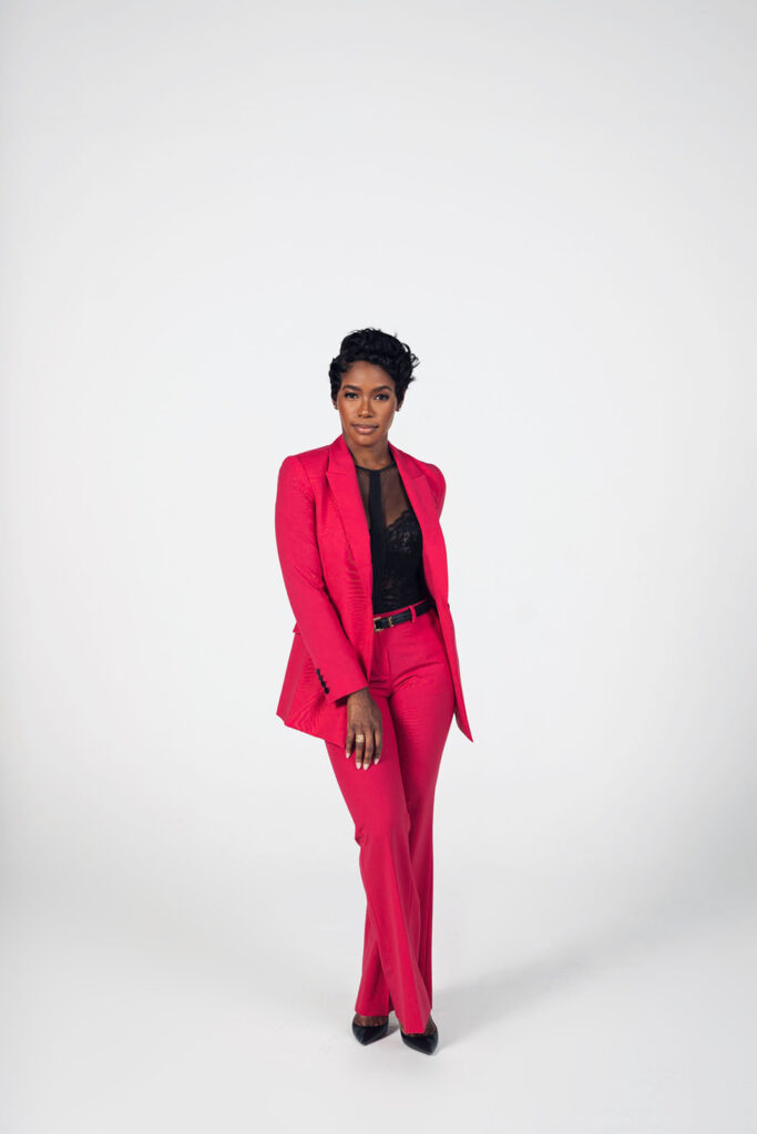
If it’s a family session, keep your color scheme limited to around four colors and communicate that to everyone coming to the session. You can choose one person to wear a feature color and have everyone else’s outfits complement that key shade.
4. Color theory helps.
Remember the color wheel from art class? Maybe you’ve happily put those middle school days behind you, but that color wheel is actually super helpful when planning what to wear! It’s a great reference point for figuring out what colors look a bit weird together and what colors are a match made in heaven.
There are two main color relationships we’d want to utilize: complementary colors and analogous colors.
4.1 Complementary colors
These incredible combinations are called complementary colors. They naturally enhance each other and create this wonderful visual harmony. They’re salt and pepper, Bonnie and Clyde, peanut butter and jelly! Complementary colors sit directly across from one another on the color wheel (think blue and orange, red and green, or yellow and purple).
4.2 Analogous colors

It’s not always about high contrast, though. We all react to color combinations differently. For those who prefer a more gentle “pop,” analogous colors might be the way to go. These are colors that sit right next to each other on the color wheel, and they can be incredibly soothing to the eye. Think of a lush jungle and all the beautiful variations of green, or the infinite hues of blue in the ocean.
5. Be careful with patterns and prints.
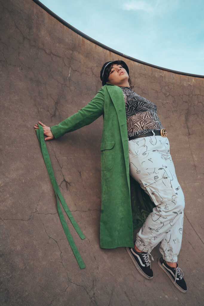
Try to avoid large, bold patterns, as they often dominate the photograph. When we look at images, our eyes are first drawn to high-contrast and high-detail areas, and patterns tend to bring attention right to the clothing (and away from your beautiful self).
Subtle, smaller patterns usually work best. Flannels or a light floral print can be great, especially if they complement the location. But, truly, less is more with this one. Try to stick to only one patterned item at a time. Matching multiple patterns is a tricky task, and it’s difficult to nail perfectly. Not to say this is impossible—some people have this as their style aesthetic and I still want it to feel true to you.
6. Layering is a plus.
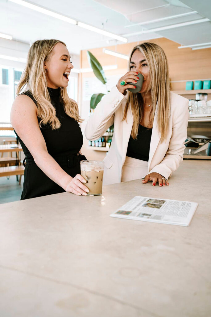
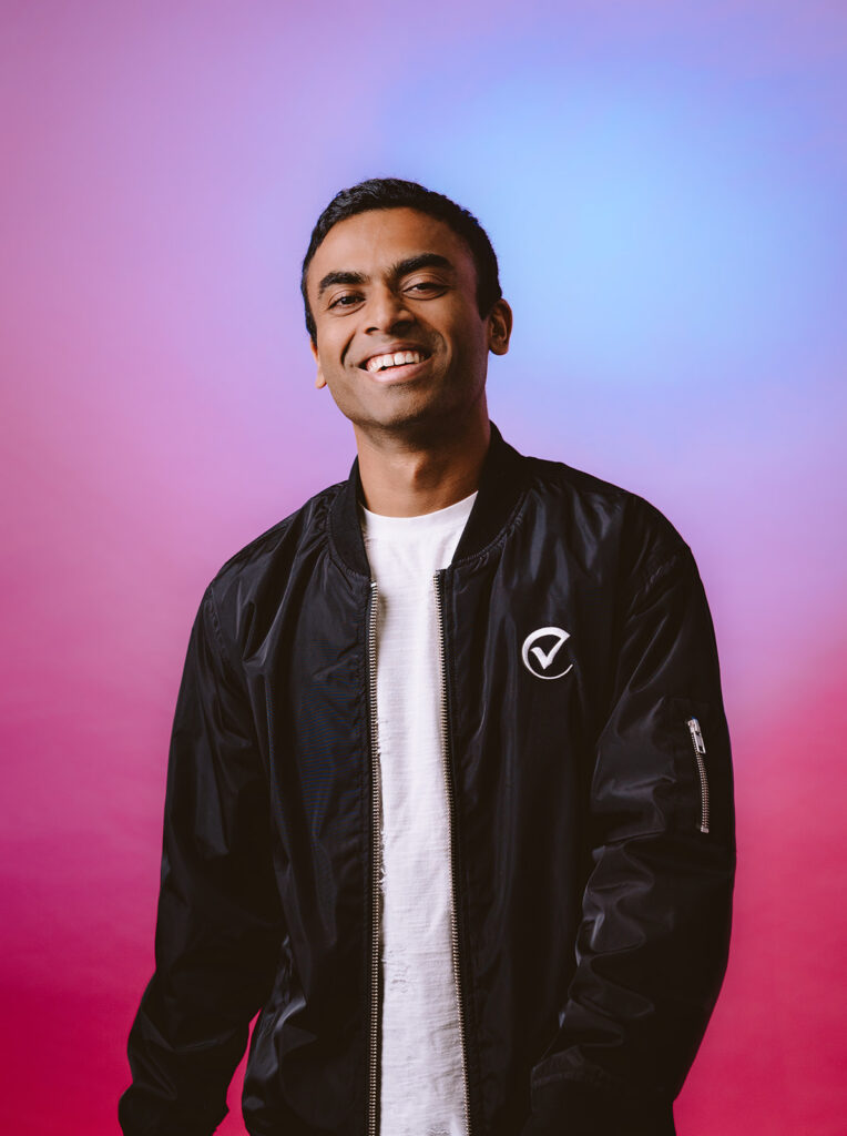
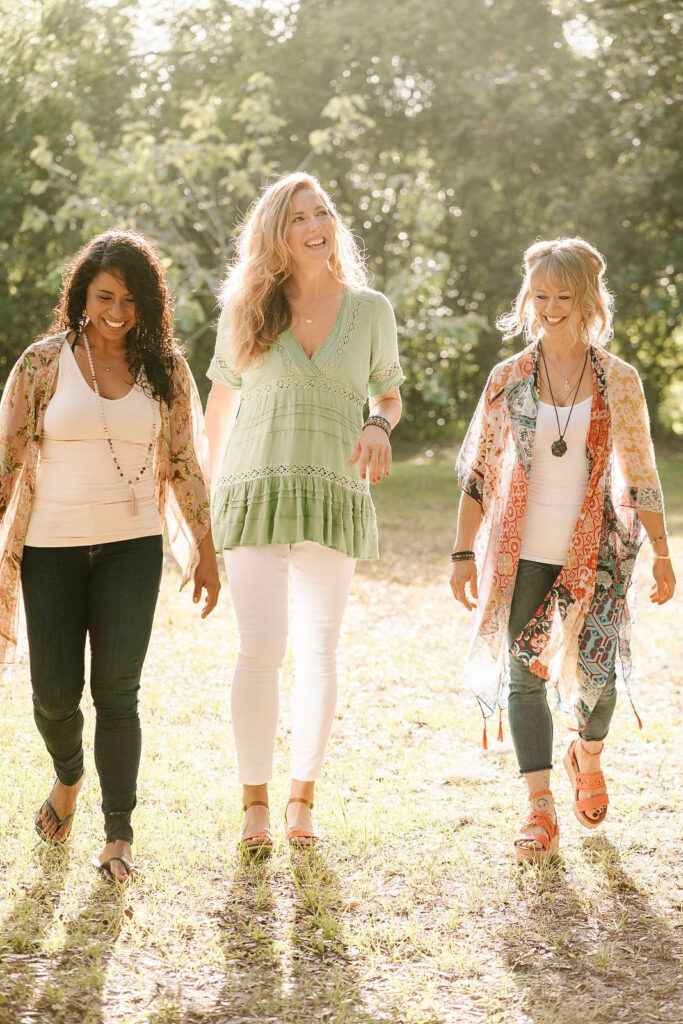
Wearing layers is a fantastic choice for both form and function. Not only does combining layers and textures create more visually interesting photographs, but it also preps you for all sorts of weather conditions if your session is outdoors.
Perhaps most importantly, layering provides us lots of creative fodder to play with posing and changing up your look quickly. Think jackets, cardigans, hats, scarves, socks, etc.
7. Try to avoid large logos.
Just like busy patterns, clothing with lots of writing or huge logos tends to be distracting. Let’s save the product placement for the commercial photoshoots where people are getting paid to wear their logos haha.
However, if the logo or phrase is not super noticeable, it fits the theme of the shoot, and it perfectly fits your personality, then I’m all for it. Sometimes a logo communicates a vibe, so it could compliment your vision.
8. Accessorize.
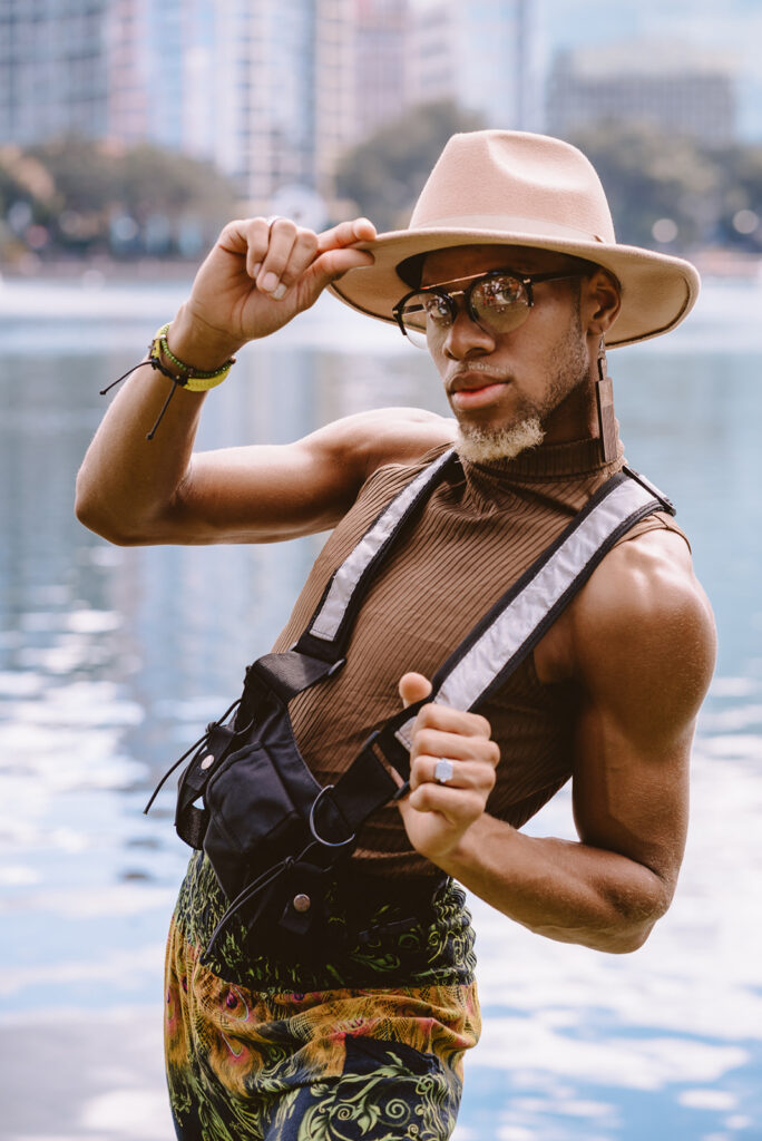
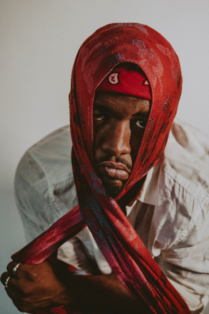
Hats, sunglasses, jewelry, and belts are all great ways to add some character to your look. Throw some extras into your bag, but be mindful of large, distracting pieces. We still want the focus to be on you.
Smart watches are a weird one. The big face of the watch can be super noticeable and create a weird visual break in your arm. It’s best to leave the watch off unless it’s deeply sentimental or a core part of your professional look or brand. Don’t worry about your watch tan line, I can edit that out!
9. Shoes are part of the look.
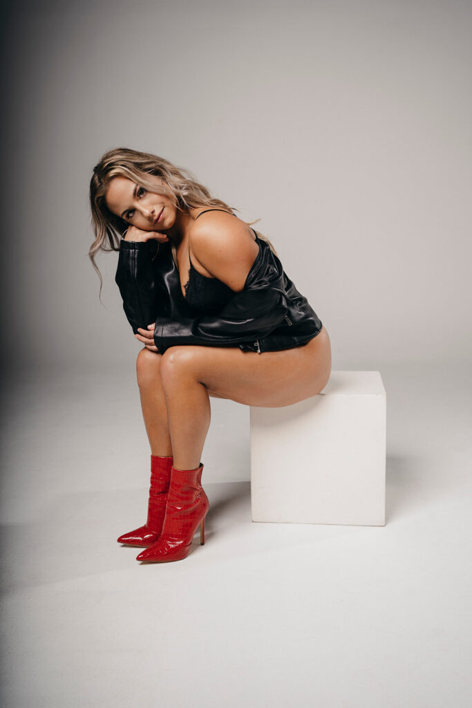
Shoes are a key part of your look and should ideally complement the rest of your outfit. I always get some full-body shots, so shoes (or lack thereof, if socks or bare feet are the vibe) should be intentional.
If you’re comfortable wearing heels, go for it. If you’re like me (and many other people) and find them uncomfortable or hard to walk in, please either pick a comfy block heel or boot, or maybe wear something else. If your session is outdoors, we’ll be walking around a bit, so perhaps bring a change of shoes you can pop on between locations. Please, I don’t want you twisting an ankle.
Choose the right shoes based on the location, and think about what you’d normally wear if I wasn’t following you around with a camera. Going barefoot makes sense on the beach, and boots are beautiful in the mountains. Leather is great for boots, and sandals win over flip-flops by a long shot. Always consider context for both aesthetic appeal and practicality.
10. Props help tell your story.
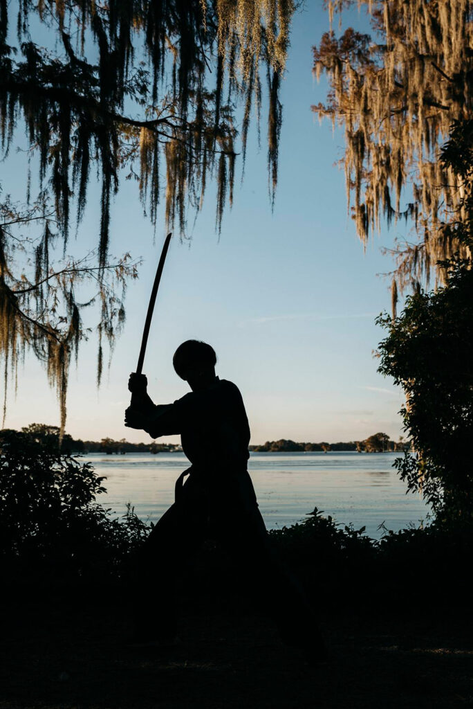
Props don’t have to be cheesy. Go for the subtle things that accentuate your personality and help tell a genuine story about your life. Think pets, a favorite instrument, a skateboard, an umbrella, a bike, or even just a beer. I try to bring relevant props when possible, but chances are you have an item or two that may fit the vision better.
11. Hair and makeup is to your liking.
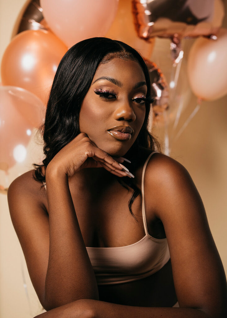
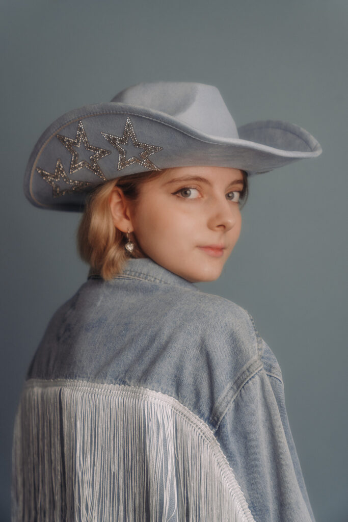
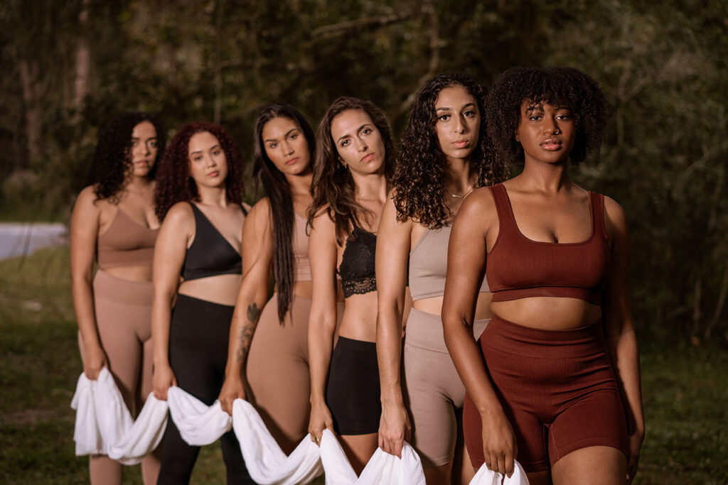
This is no pressure and totally your call. But, I’d gently suggest cultivating a bit of that French je ne sais quoi that balances elegance and ease so well. The goal is to make you look like you—just a little extra polished. So, do whatever you need to feel confident and beautiful!
Your hands tell such an amazing story about who you are and where you’ve been, and they play a crucial role in portrait photography. Sometimes, photos just magnify bright nail polish, chipped manicures, or dirty fingernails. Once you see it, you can’t un-see it—your eye keeps zooming in on that one spot, which is really distracting. Treat yourself to a subtle manicure or just make sure your nails are neat and tidy before the shoot. A little cuticle care and nail filing goes a long way.
As for hair: up-dos are alright, and I totally get it—it’s so easy to throw your hair up! But when it comes to capturing a moment to keep forever, hair down is the way to go. With your hair down, you get that movement, that interest, and some perfect slices of imperfection in the best possible way.
You don’t necessarily need to pay a professional to do your hair. Do what makes you feel like yourself and confident! Maybe that is getting some extra help, maybe not. Maybe a little hair accessory is all you need.
Ready to plan your perfect outfit?
Deciding what to wear is the first fun step in creating photos that feel 100% authentic to you. My goal is to make sure you show up feeling like your most confident self, ready to play and express your unique personality.
And let’s be real—we’re not all stylists and I know I just threw a lot of information at you. I don’t expect you to be a pro after reading this blog. Feel free to contact me we can chat through your vision, your location, and every perfect detail of your wardrobe! I’ll give you feedback as to what will look amazing on camera and how to create your dream photos.


